
Macdoch is a private investment group with offices in Sydney and London, who have a diverse portfolio of clients across an increasing number of sectors.
Macdoch approached Chapter to update their brand portfolio to better represent and connect to the diversity of audiences they now work with, as Alex had designed their original brand identity some 10 years ago.
We conducted a strategic review of Macdoch to gain a full understanding of all their functions and how they benefited their current customer base. From the insights we gained we developed a scalable brand framework that works across all of the business platforms and allows for business growth and expansion.
We have applied this strategic approach to several of the business pillars in the group developing specific identities and visual languages to connect them more meaningfully to their target audiences.
Delivering a clear masterbrand connected directly to the dynamic businesses within it.
ClientMacdoch GroupServicesBrand portfolio analysis, portfolio management, brand strategy, brand identity, brand creation, illustration, tone of voice, brand assetsYear2020
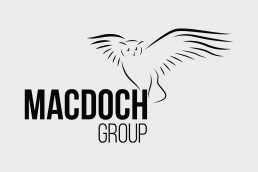
The new brand has a much fresher and more confident feel to both the illustrated logo and the updated typography.
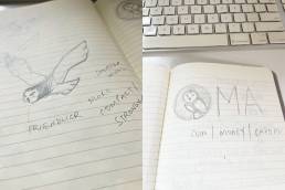
The original logo designed some 10 years ago:
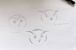
We explored many variations of the owl, an icon close to the CEO’s heart, but the final collaborative decision was made to stay close to the original posture which exudes an air of confidence and togetherness.